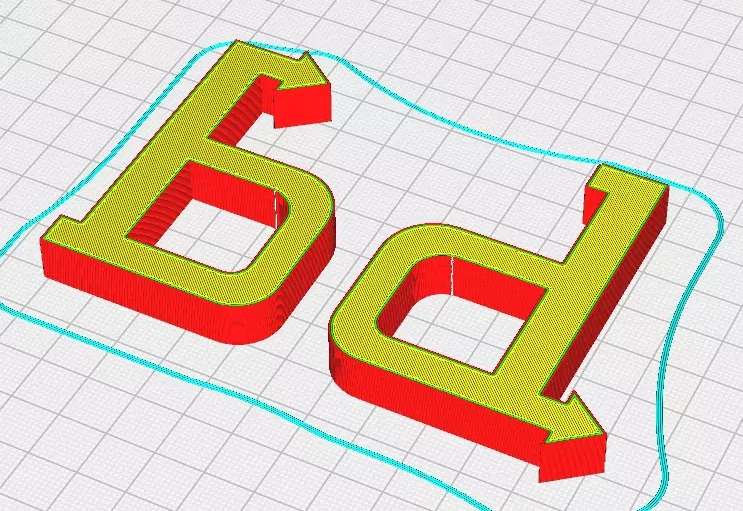
It’s easy to forget how tricky learning the difference between ‘b’ and ‘d’ can be for younger students. Modern fonts only exacerbate the problem — where b, d, q, and p are usually the same glyph reflected across an axis.
3D printing to the rescue: the files attached below are models of ‘b’ and ‘d’ affixed with arrow-shaped serifs. I’ve had success encouraging students to “make the arrow go with the word,” i.e. aligning the arrow left to right (reading direction) puts the characters in the correct orientation.
Here’s to hoping that a physical object to touch/lift will a) be helpful and b) make the process at least a little more fun.